Confirmation modals are powerful tools in user interface design that provide a layer of protection against accidental actions and help users make informed decisions. However, confirmation modals are disruptive and can be distracting to the user. Use them sparingly.
When to use
An immediate response is required from the user.
-
Confirm a user decision.
Anatomy

Title
Body
Actions
Title
A confirmation’s purpose should be communicated by its title.
Titles should:
Contain a brief, clear statement or question.
Avoid apologies (“Sorry for the interruption”), alarm (“Warning!”), or ambiguity (“Are you sure?”)
Write in sentence case, capitalize the first word and proper nouns only.
Avoid articles (the, a, an) to keep content short and actionable.
Avoid using punctuation.
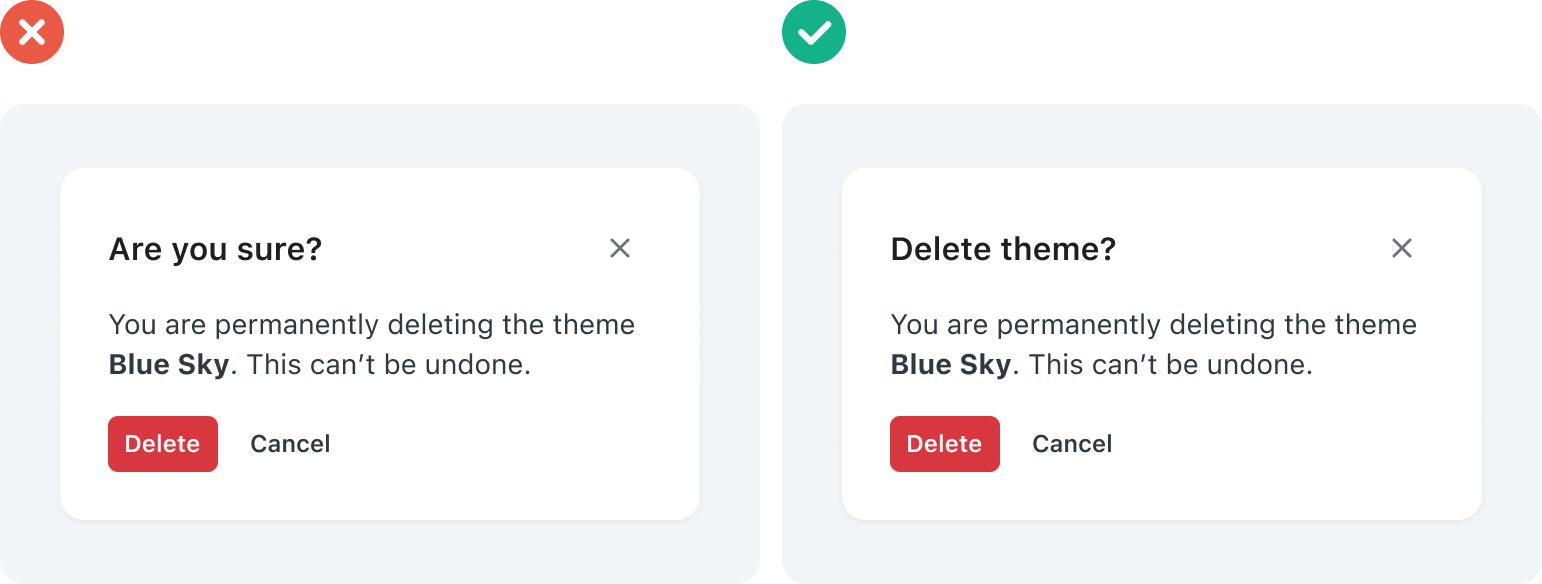
Don't - Don’t use confirmation titles that pose an ambiguous question.
Do - This confirmation title poses a specific question, concisely explains the purpose of the confirmation.
Body
The body of the confirmation modals provides additional information and context about the action being confirmed. It explains the consequences or effects of the action and helps users make an informed decision.
Body should:
Use clear and concise language.
Clearly describe the action and explain the potential outcomes or consequences associated with it.
Avoid common phrases like “Are you sure?” which can lead to confirmation fatigue and make the experience monotonous.
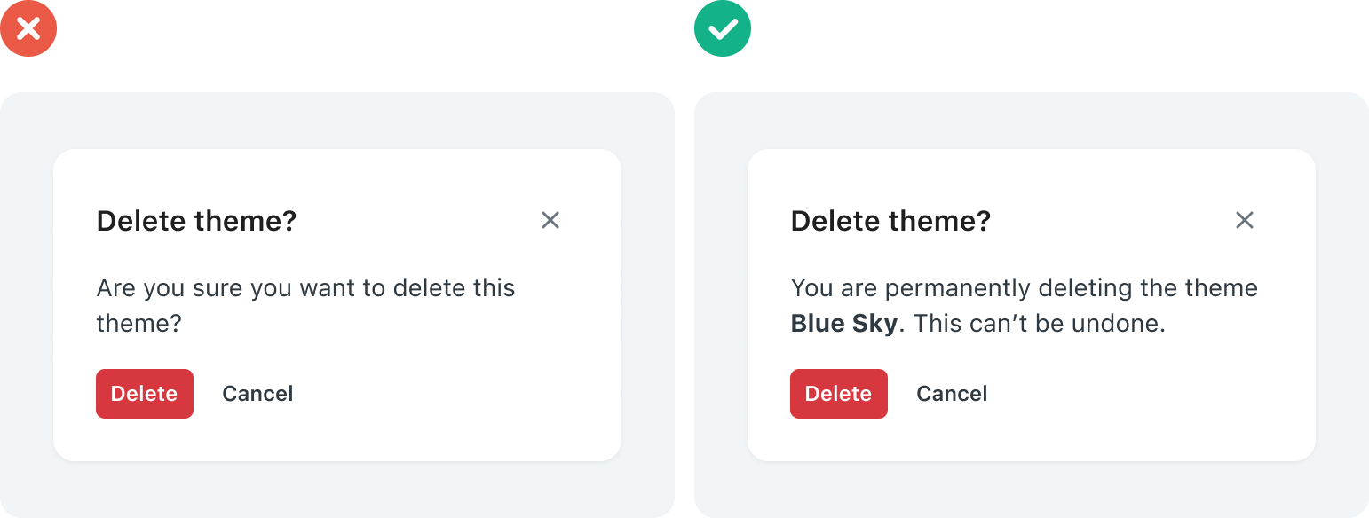
Don't - Avoid using generic or ambiguous messages in your confirmation modals
Do - This confirmation body explains the consequences of the action.
Actions
Confirmation actions are most often represented as buttons and allow users to confirm, dismiss, or acknowledge something.
Confirmation should contain a maximum of two actions.
If a single action is provided, it must be an acknowledgement action.
If two actions are provided, one must be a confirming action, and the other a dismissing action.
Actions should:
Be clear and predictable: users should be able to anticipate what will happen when they click a button.
Scannable: avoid unnecessary words and articles such as “the,” “an,” or “a”.
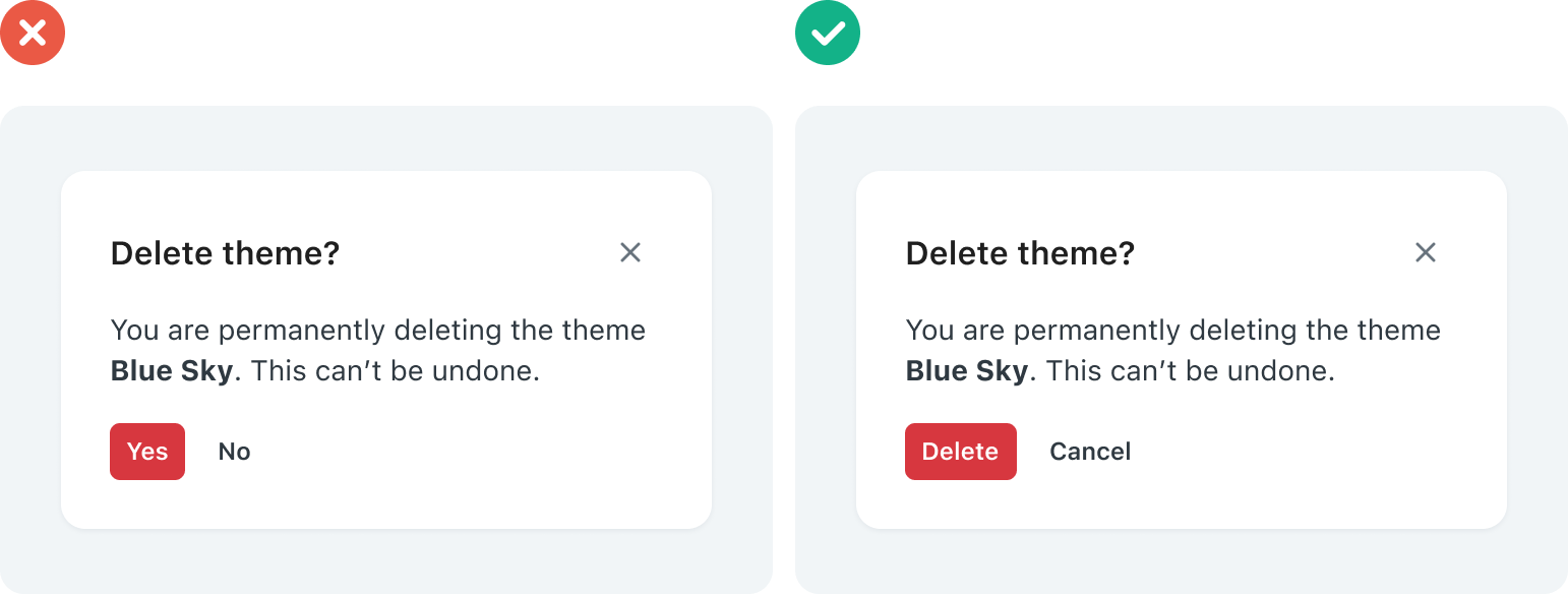
Don't - These buttons do not have specific action labels that indicate what happens when the user clicks them.
Do - This confirmation uses clear and action-oriented labels.