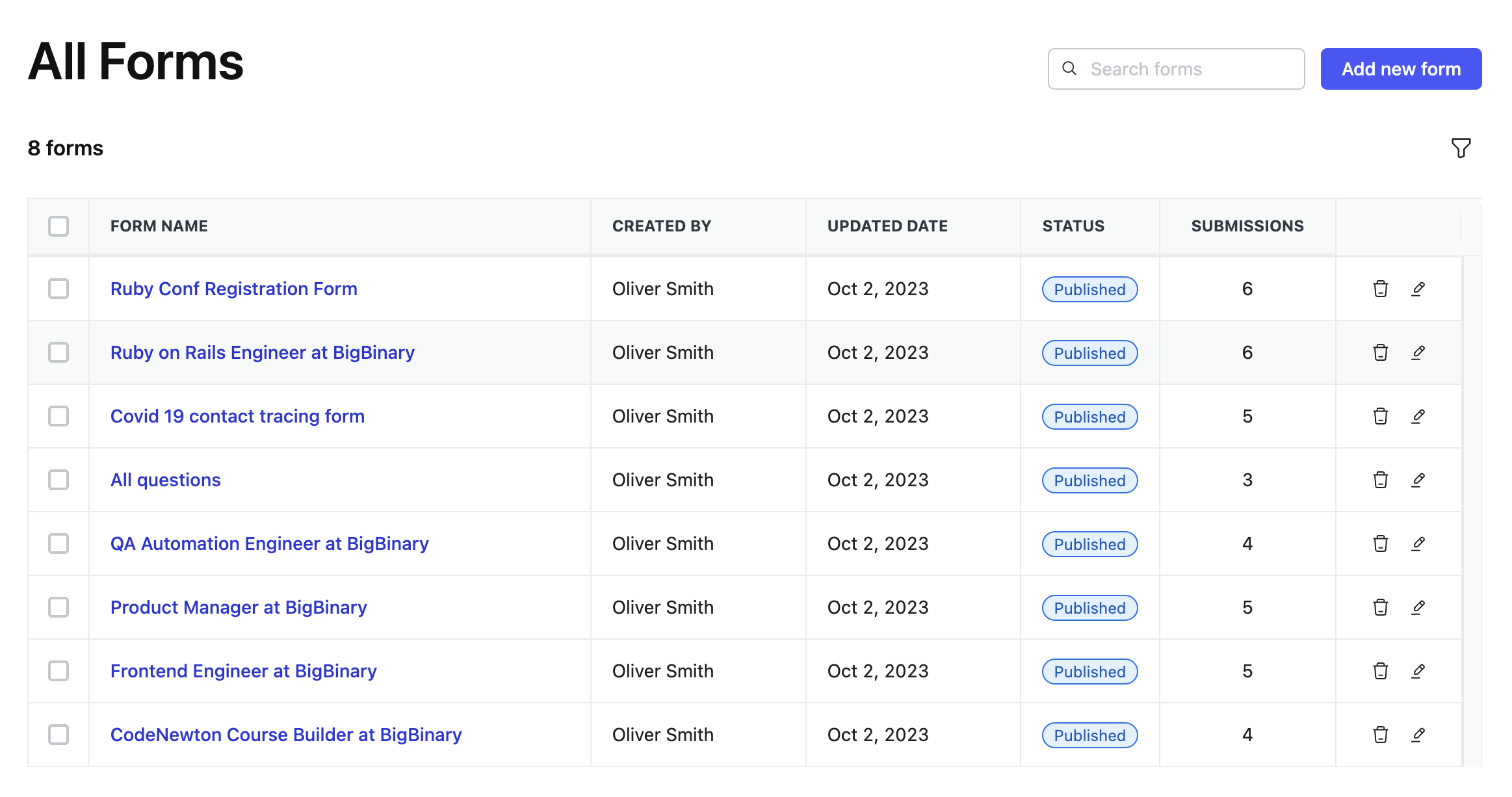
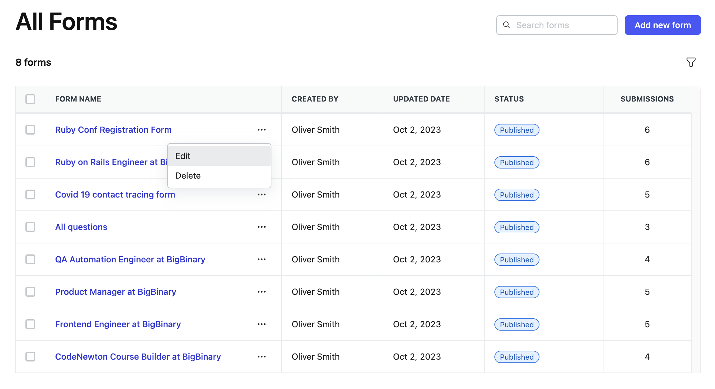
Placing icons next to each other in the last table column could distract users particularly when they aren't actively engaged in these actions. To address this, we have introduced the following best practices.
Best practice
-
Use the tree-dot menu to incorporate the action items within it.
Do's and Don'ts
🚫 Don't
As you can observe, the edit and delete icons are grouped and placed in the last column of the table. These actions are relatively infrequently used by users from the table, which can create unnecessary distractions.
✅ Do's
Choosing the three-dot menu to accommodate these action items not only minimizes unnecessary distraction but also facilitates easy access to these actions when needed. Since these actions are conveniently located in the first column, users won't have to scroll extensively, even when there are numerous columns.
Reference to GitHub discussion
https://github.com/bigbinary/neeto-engineering-ui-ux/issues/32

