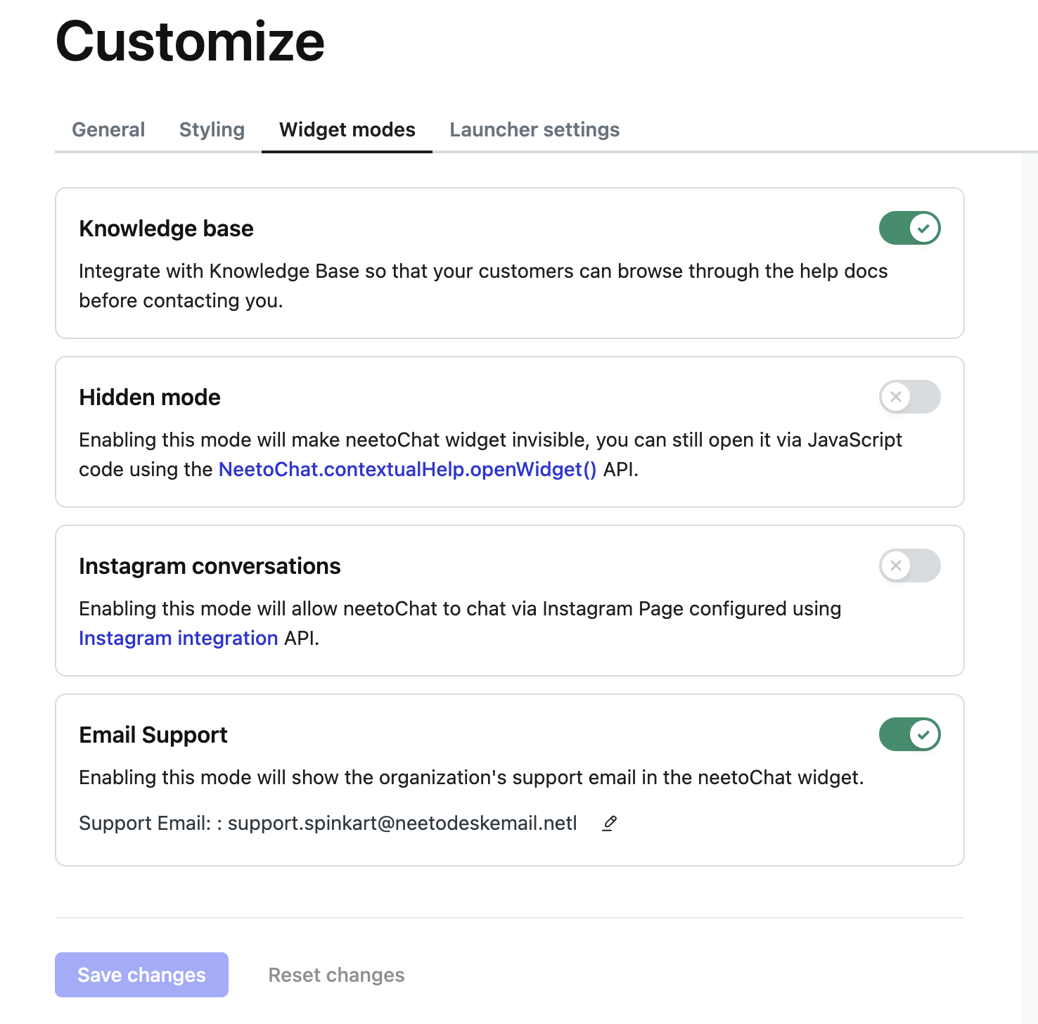
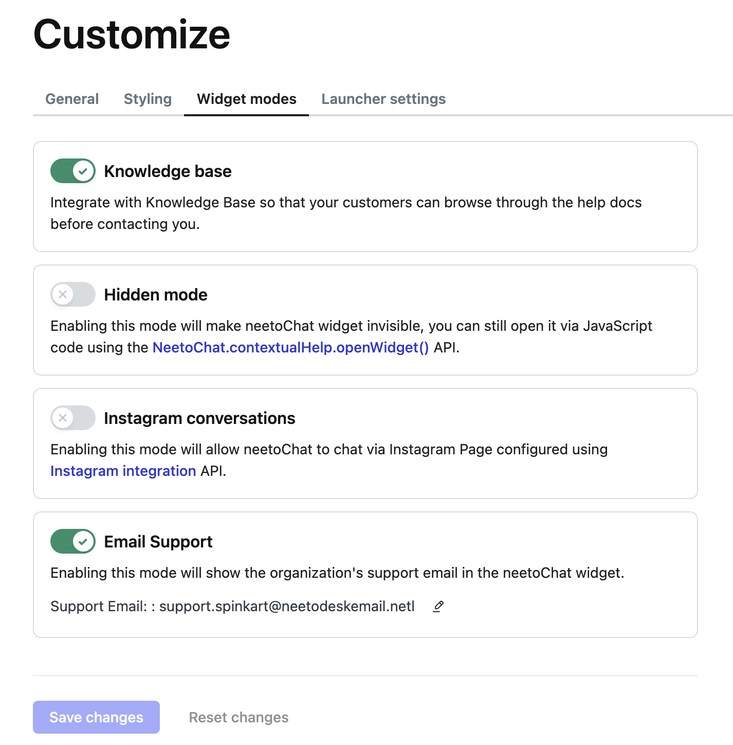
Previously, we positioned the toggle switch to the right of the label, aligning it all the way to the far right. Unfortunately, this approach led to an undesirable gap between the label and the toggle switch. To solve this issue, we have now adopted the following best practices for enhancement.
Best practices
The position of the toggle switch must be decided by the context.
Place the toggle switch before the label when there is excessive gap between label and toggle switch.
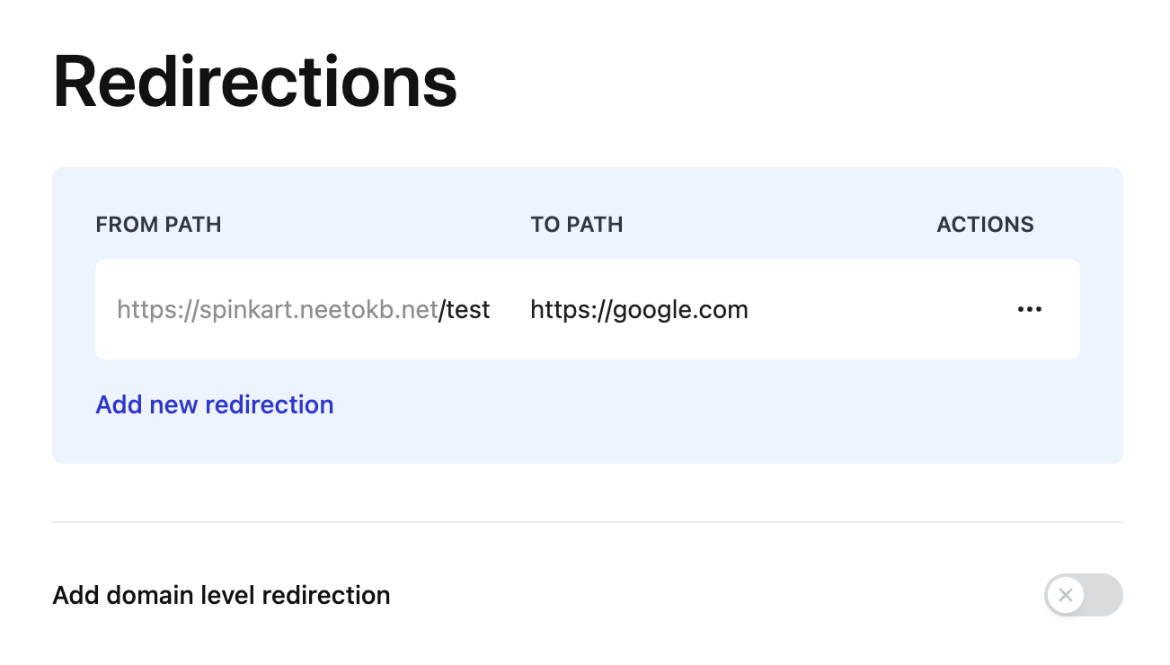
Don't place the toggle switch before the label when it affects the overall alignment.
Clicking on label should toggle the switch.
Refer Switch documentation to learn more.
Do’s and Don’ts
🚫 Don'ts
✅ Do's
Reference links
https://github.com/bigbinary/neeto-engineering-ui-ux/issues/39