Dark mode has evolved from a visual trend to an essential feature that:
Reduces eye strain in low-light environments.
Improves battery efficiency on modern devices.
Enhances accessibility for all users.
All Neeto products now support dark mode through NeetoUI, providing a consistent experience across our platform.
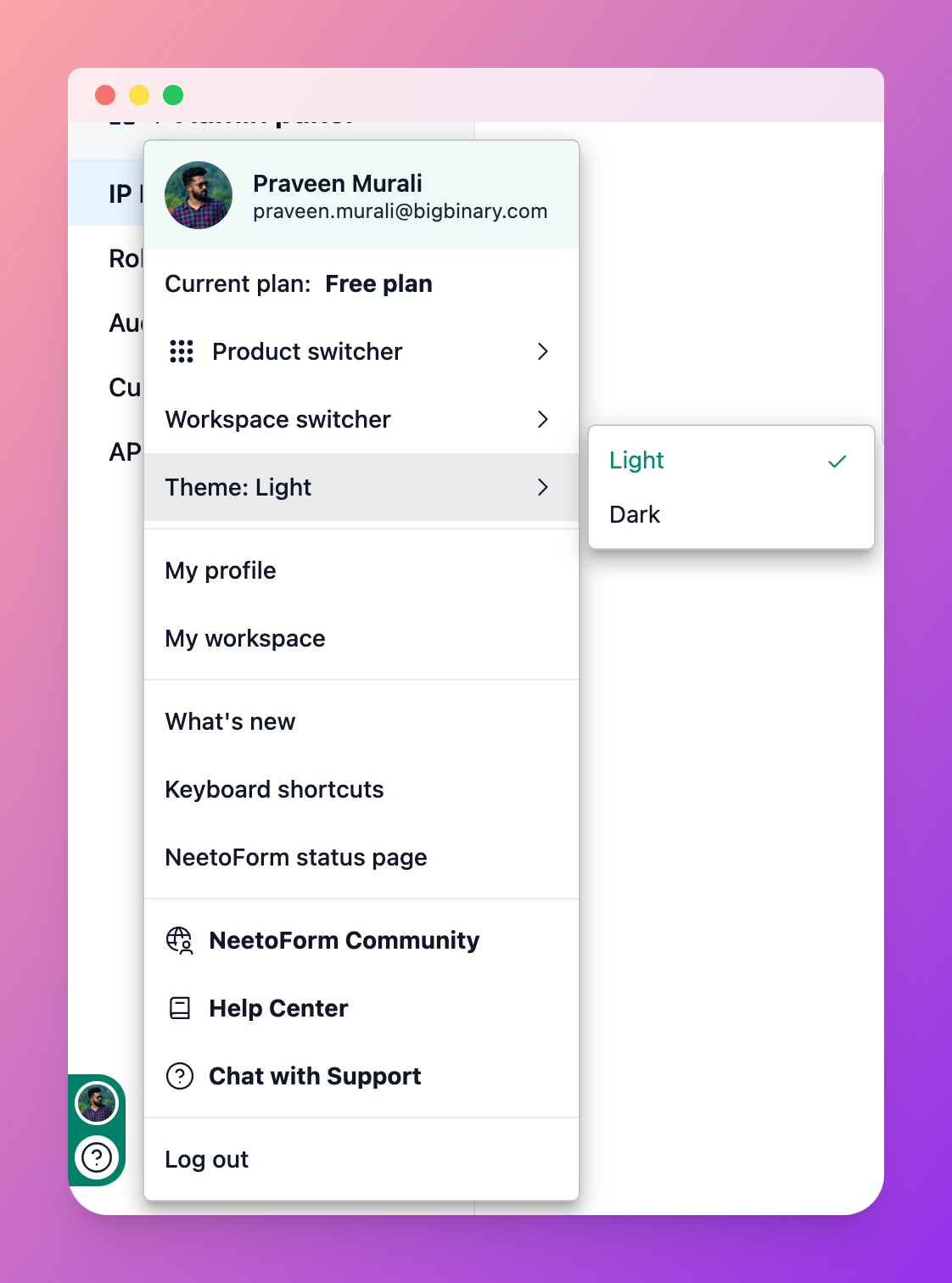
How to enable dark mode?
Open the floating action menu(located at the bottom-left corner).
Toggle the dark mode switch.
The UI will instantly adapt to the selected theme.
How dark mode works in NeetoUI?
NeetoUI's dark mode implementation uses:
-
Predefined utility classes for:
When dark mode is enabled, the CSS variables automatically update their color values to reflect the darker theme.
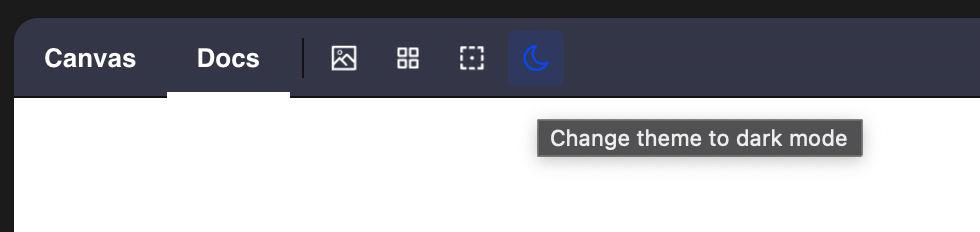
See it in action
Toggle dark mode directly in the NeetoUI Storybook using the toolbar switch.
Development Instructions
1. Use NeetoUI colors properly
When translating designs to code:
✔️ Use NeetoUI's colors (not direct hex/RGBA values from Figma or Wireframe). Directly using hex/RGBA values will not automatically adapt to the dark theme, leading to visual inconsistencies.
✔️ Use NeetoUI utility classes like text utilities (e.g.,
neeto-ui-text-gray-800), background utilities (e.g.,neeto-ui-bg-gray-100), and border utilities (e.g.,neeto-ui-border-gray-300).
Why this matters:
Ensures automatic dark mode support
Maintains visual consistency
Simplifies future updates
2. Theme-sensitive styling
Avoid using Tailwind's native classes for
Text colors (
text-*)Backgrounds (
bg-*)Borders colors (
border-*)Shadows (
shadow-*)
Instead, reference NeetoUI's dedicated classes in Storybook.
3. Test dark mode compatibility
For every UI change:
Verify appearance in light mode
Confirm proper rendering in dark mode
Common pitfalls to avoid
❌ Hardcoding color values (breaks theme synchronization)
❌ Combining Tailwind theme utilities (creates inconsistencies)
❌ Overriding NeetoUI variables (unless absolutely necessary)