In the past, we organized bulk action items within the subheader, with some aligned to the left and others to the right. These action items remained disabled when no records were selected in the table. However, issue with this UI was:
The buttons consistently displayed in a disabled state, even when no records were selected.
To address the above issue, we have implemented the following best practices for improvement.
Best practices
All the actionable items need to be together.
Use
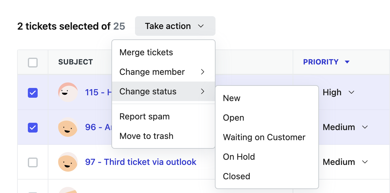
Take actionas label for Dropdown target button.Move all the bulk actionable items to neetoUI Dropdown even if it’s a single item.
Format for displaying number of selected records - 2 tickets selected of 26
Keep 16px gap between selected records info and Take action dropdown
Don't use icons for dropdown items.
For multi level dropdown menus add a right arrow as suffix to dropdown menu item, See Dropdown with prefix and suffix documentation.
You can go through SubHeader documentation and get more clarity on usage of action items.
Do’s and Don’ts
🚫 Don’t
✅ Do
Reference links
https://github.com/bigbinary/neeto-engineering-ui-ux/issues/1
https://github.com/bigbinary/neeto-engineering-ui-ux/issues/29
https://github.com/bigbinary/neeto-engineering-web/issues/179