Section titles are a common UX pattern used to group related controls in an interface, especially in admin panels where a wide range of configuration options need to be presented. However, as interfaces evolve and priorities shift toward clarity and minimalism, it's worth questioning whether section titles are always necessary.
In a recent UI audit of NeetoEngage’s admin panel, we explored this very question. Below, we’ll break down the decisions, observations, and outcomes—focusing on the “Customize” screen before and after the removal of certain section titles.
NeetoEngage case study
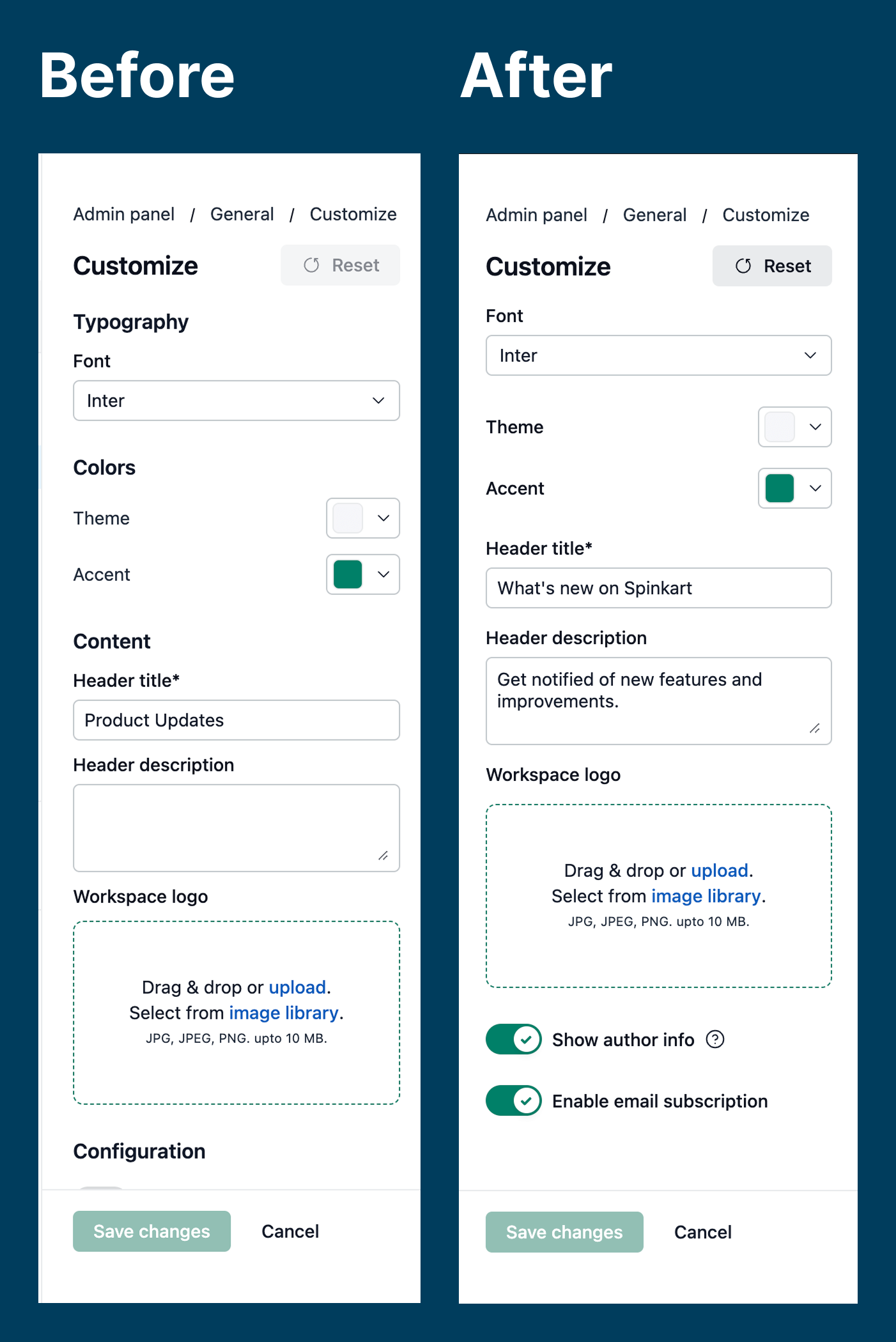%20(1).png)
Before: A heavily structured layout
The original layout used explicit section titles—like “Typography,” “Colors,” “Content,” and “Configuration”—to divide the form into labeled blocks. This approach follows a traditional form-building style, offering clarity for first-time users by naming each group of settings.
Pros:
Distinct separation of content types.
Easier for new users to scan and understand the structure.
Improves accessibility for screen readers (if implemented correctly).
Cons:
Introduces visual clutter, especially if the titles don’t add unique semantic value.
Repeats information that is already clear from the form elements themselves (e.g., “Font” under “Typography” is arguably redundant).
Disrupts visual flow for power users who already understand what each field does.
After: Streamlined and intentional
In the updated layout, section titles like “Typography,” “Colors,” and “Content” have been removed. Instead, the design relies on proximity, whitespace, and alignment to visually group related items.
Pros:
Clean, minimal UI that reduces noise and promotes focus.
Faster scanning and fewer distractions for experienced users.
Less vertical space used, especially beneficial on smaller screens.
Cons:
Slightly higher cognitive load for new users, especially without contextual cues.
Risk of confusion if the visual hierarchy is not clear enough.
Example: when section titles add clarity
The following screenshot demonstrates a well-structured use of section titles in NeetoForm properties panel.
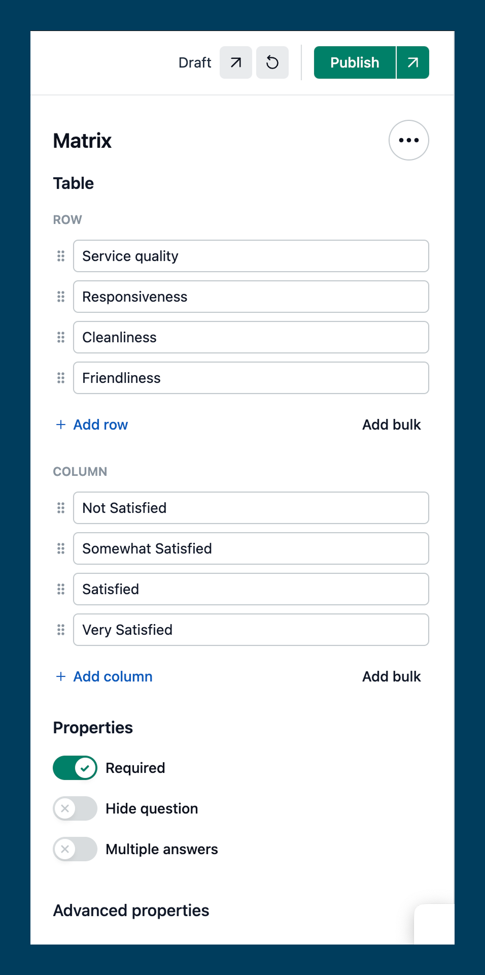.png)
Looking at the screenshot, we see the following section titles:
Table: this groups the "row" and "column" inputs, which define the structure of a matrix question.
Row: this labels the section where users define the rows of the matrix.
Column: this labels the section where users define the columns of the matrix.
Properties: this groups general behavior settings for the question, such as "required," "hide question," and "multiple answers."
Advanced properties: this implies a set of less commonly used or more advanced options.
Do the section titles add value here?
Yes — in this context, the section titles play a meaningful role in improving the interface:
Organization of complex content: since the component involves multiple distinct inputs (rows, columns, behaviors), the titles help clarify structure.
Logical grouping of related controls: separating general properties from advanced ones prevents cognitive overload.
Improved scannability: titles act as visual anchors, making it easier to locate and modify specific aspects of the question.
Clarity of functionality: labels like "row" and "column" remove ambiguity about what users are editing.
When to keep section titles?
Retain section titles when:
You’re introducing complex or unfamiliar configuration areas.
Groupings are not visually obvious from layout alone.
You want to explicitly signal a shift in context (e.g., moving from “Content settings” to “Security settings”).
When to remove section titles?
Consider removing section titles when:
Field labels and grouping already communicate enough meaning.
You’re working within a compact layout.
The titles are generic or redundant (e.g., a “Typography” title directly above a “Font” dropdown).
Conclusion: Clarity without redundancy
The updated NeetoEngage panel strikes a better balance for its audience. By eliminating redundant section titles and relying on clean spacing and alignment, it delivers a modern, focused experience that favors usability without sacrificing clarity.
Use section titles when they clarify, not just to conform. In minimalist design, every extra label should justify its presence. If it doesn't add new value, it's better left out.