Introducing the CardLayout Component
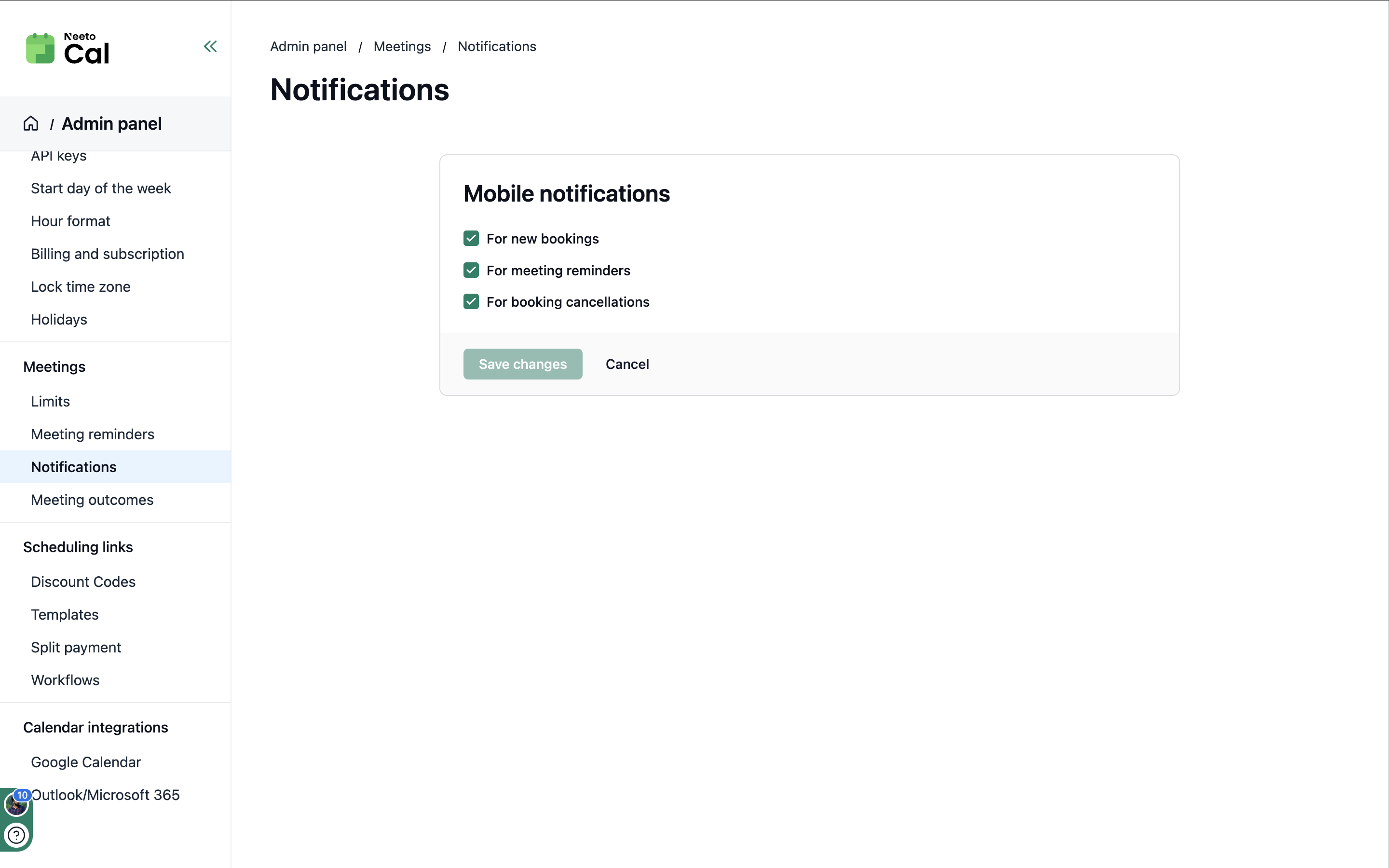
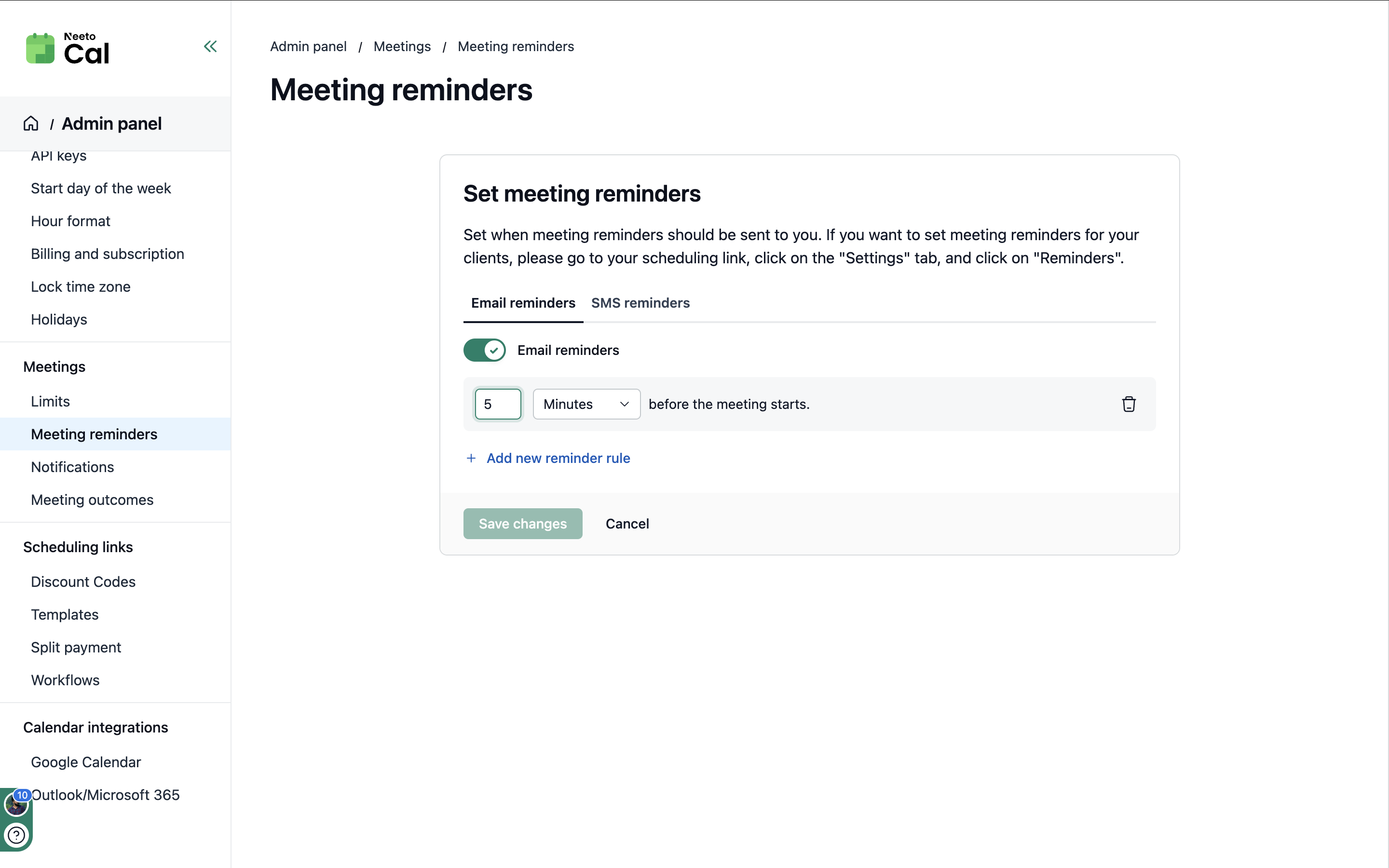
The CardLayout component provides a consistent and reusable container for displaying card-based content. It ensures visual harmony across all Neeto products.
Problem:
Previously, card implementations were inconsistent, leading to:
Inconsistent spacing: Variable padding and margins within cards.
Inconsistent borders and shadows: Different border styles and inconsistent use of shadows.
Inconsistent rounded corners: Varying corner radius.
Proliferation of custom cards: Over 14 different card components existed.
Solution: The CardLayout Molecule
CardLayout addresses these issues by offering:
Standardized spacing: Consistent padding and margins.
Consistent styling: Uniform borders, shadows, and rounded corners.
Responsive design: Built-in responsiveness for different screen sizes.
Customization flexibility: Options for specific adjustments when necessary.
Basic usage:
<CardLayout
  title="Project Settings"
  description="Configure your project preferences"
  actionBlock={
    <div className="flex gap-2">
      <Button label="Save" style="primary" />
      <Button label="Cancel" style="text" />
    </div>
  }
/>
Refer to the Storybook documentation for detailed usage and variations.
Examples
Maintaining Consistency:
To ensure a unified user experience:
Use CardLayout for new card implementations whenever possible.
Avoid creating custom card components. This undermines consistency.
Request enhancements if
CardLayoutlacks necessary features.

