Empty states appear when there’s no content to display. They help users understand what’s happening and guide them on what to do next.
At Neeto, we use standardized components to ensure consistent and user-friendly experiences across products:
Use the NeetoUI NoData component for regular empty states.
Use the NeetoMolecules ErrorPage component for error states, including 404 pages.
When to use each component
Scenario |
Component |
Example Cases |
|---|---|---|
No items exist yet |
NoData (NeetoUI) |
Empty project list, new user flow |
No search/filter results |
NoData (NeetoUI) |
Empty search results |
Feature not available |
ErrorPage (Molecules) |
Permission-restricted features |
404 Page Not Found |
ErrorPage (Molecules) |
Broken links, deleted content |
Network/server errors |
ErrorPage (Molecules) |
API failures, connection issues |
Guidelines for using the NoData component
Use the NoData component when there’s simply no content to show (not due to an error).
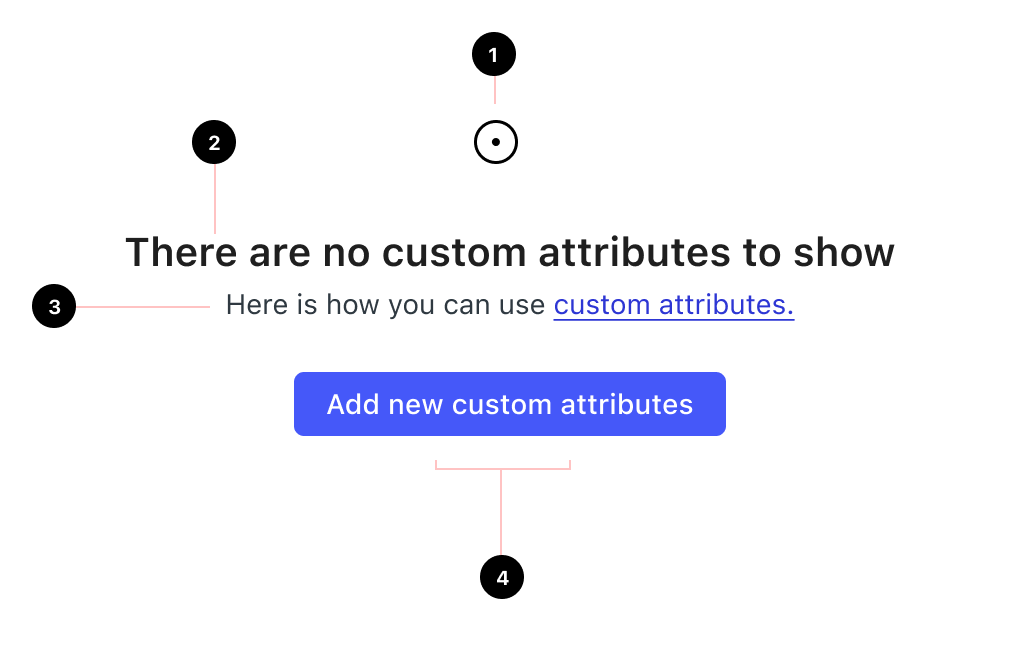
1. Image
Avoid using images within the NeetoUI NoData component, even though the component technically supports an image prop. The primary focus should be on delivering a clear and concise message to the user.
2. Title
Keep it clear and concise.
Use sentence case.
Avoid articles (a, an, the) and end punctuation.
🚫 Don't: Oops! You don’t have any invoices.
✅ Do: There are no invoices to show
3. Description
If necessary, provide brief and actionable additional context or instructions. You can also include links to relevant documentation.
4. Actions
Provide clear calls to action. Tell the user what they can do next, such as adding new data, searching for data, or refreshing the page.
Actions should:
Be clear and predictable: users should be able to anticipate what will happen when they click a button.
Scannable: avoid unnecessary words and articles such as “the,” “an,” or “a”.
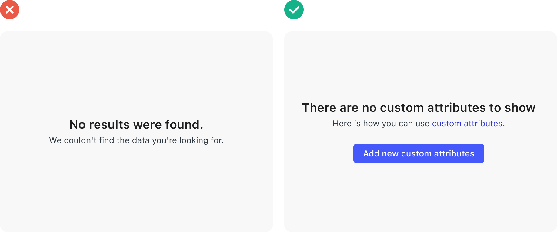
🚫 Don't - The title and description are very general, and they do not provide any specific information about the type of data that the user is looking for. The CTA is empty, so it does not provide any guidance for the user on what to do next. This can be confusing for users who do not know what to do.
✅ Do - The title clearly tells the user that there are no custom attributes to show, and the description provides a link to documentation on how to use custom attributes. This is helpful for users who are specifically looking for custom attributes. The CTA encourages the user to take action by adding new custom attributes. This is helpful for users who want to start using custom attributes.
Using the ErrorPage NeetoMolecule
Use the NeetoMolecules ErrorPage component for error states, including 404 pages, network issues, or when users attempt to access a feature they don't have permission for.
👉 View ErrorPage documentation →