Red is a powerful color that can be used to great effect in UI/UX design. However, it's important to use it carefully, as it can also be overwhelming and even alarming.
Key considerations
Indicate importance and urgency: Red is a great way to grab the user's attention and make them focus on something important.
-
Use red sparingly: If you use red too much, it can become overwhelming and even stressful for users. Instead, use red strategically to highlight the most important elements of your design
When to use
-
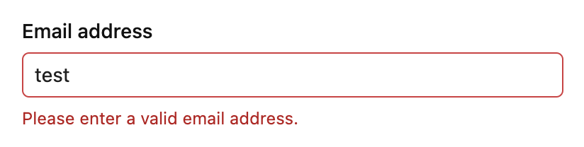
Error messages: Red is often used for error messages because it's a good way to grab the user's attention and let them know that something has gone wrong.
-
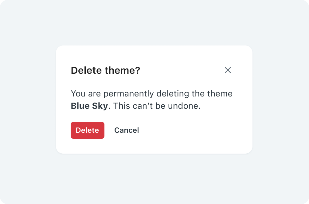
Destructive actions within confirmations: Red can be used for destructive buttons inside confirmation modals.
.png)
To prevent users from accidentally deleting something important, use a confirmation modal before performing a destructive action and give users a chance to cancel.
-
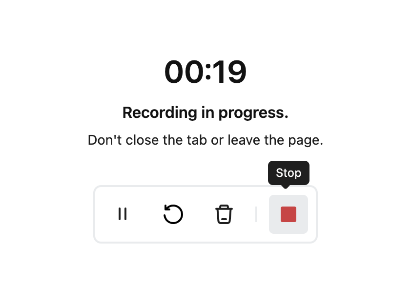
Screen recording stop buttons: Using red for the stop button is a common practice because the color red is associated with urgency and can quickly catch the user's attention. When someone is recording their screen, it's crucial to have a highly visible stop button to ensure that they can easily end the recording when needed.