Providing clear feedback during loading states is crucial for a positive user experience. Two common UI elements for this purpose are PageLoader and Spinner. While both indicate that something is happening in the background, they serve different purposes and are appropriate in different contexts within Neeto.
Understanding PageLoaders and Spinners
PageLoader: A full-page loading indicator that typically uses our brand’s green color and large size. It covers the entire viewport and signals significant transitions or loading processes.
Spinner: A smaller, neutral-colored loading indicator used for localized content loading within a page. Its subtle appearance allows it to blend seamlessly with the surrounding UI.
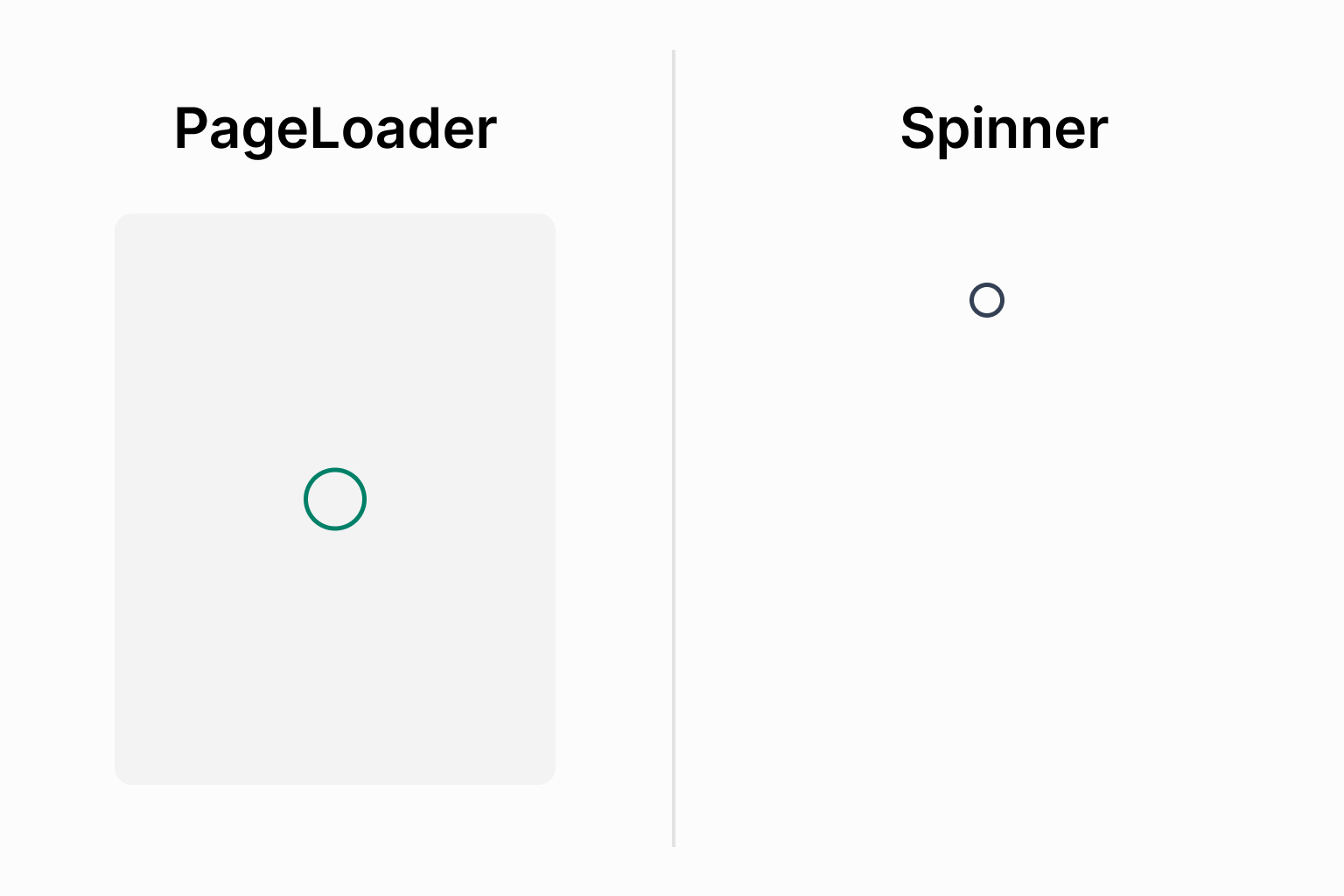.png)
When to use a PageLoader
Use a PageLoader when:
Full page transitions: Navigating between distinct pages.
Initial application load: When the application is first loaded, and user interaction is blocked until loading completes.
Brand emphasis: To reinforce brand identity during major loading periods.
When to use a Spinner
Use a Spinner when:
Partial content loading: Updating specific sections such as tables, forms, or cards without affecting the full layout.
Micro-interactions: Quick, localized feedback from actions like button clicks or toggles.
Consistent layouts: For admin panels with persistent elements like sidebars, where only the main content area is loading.
Neutral feedback: When a minimal, non-distracting indicator is preferred to avoid drawing focus away from content.
Design considerations
Color usage:
PageLoaderuses the brand green to signal important loading events, whileSpinneruses a neutral palette to avoid clashing with green success indicators like checkmarks. In some micro-interactions, we show a green checkmark after loading; using green for both loading and success states can make it difficult to distinguish between the two.Size and placement: PageLoaders are large and centered to dominate the screen. Spinners are compact and placed within the component that is loading.
Summary
Scenario |
Recommended Indicator |
|---|---|
Full page navigation (end-user interfaces) |
PageLoader |
Initial application/module load |
PageLoader |
Loading specific sections (tables, forms) |
Spinner |
Admin interfaces with persistent layouts |
Spinner |
Micro-interactions (button clicks) |
Spinner |
Emphasizing brand during loading |
PageLoader |
Neutral, subtle loading feedback |
Spinner |