Previously, we used the danger style for all the delete actions (buttons/icons/text), which was distracting for the users. To address this issue, we have adopted the following best practices for improvement
Best practices
-
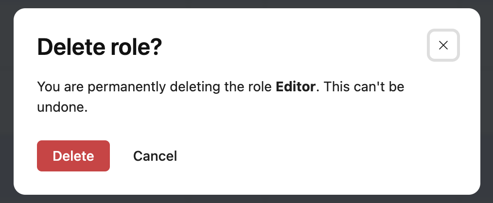
Use danger style for destructive buttons which are used in the final confirmation message for destructive actions.
Do’s and Don’ts
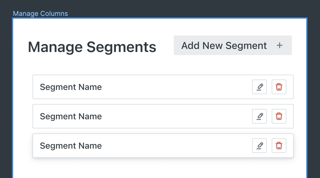
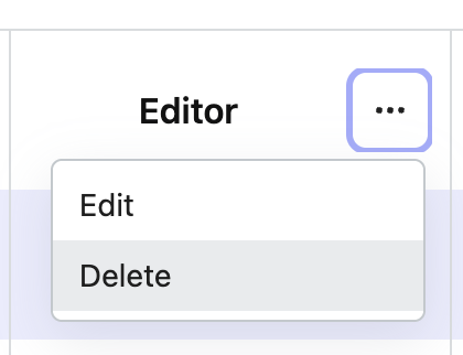
🚫 Don’ts
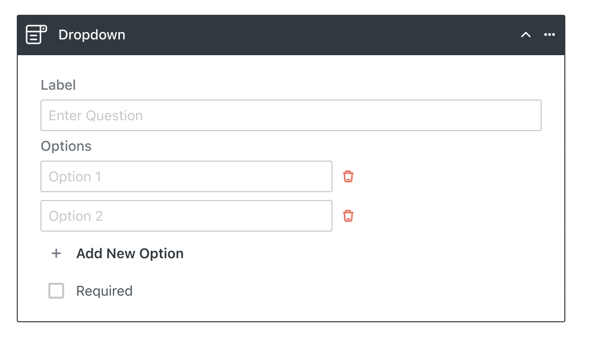
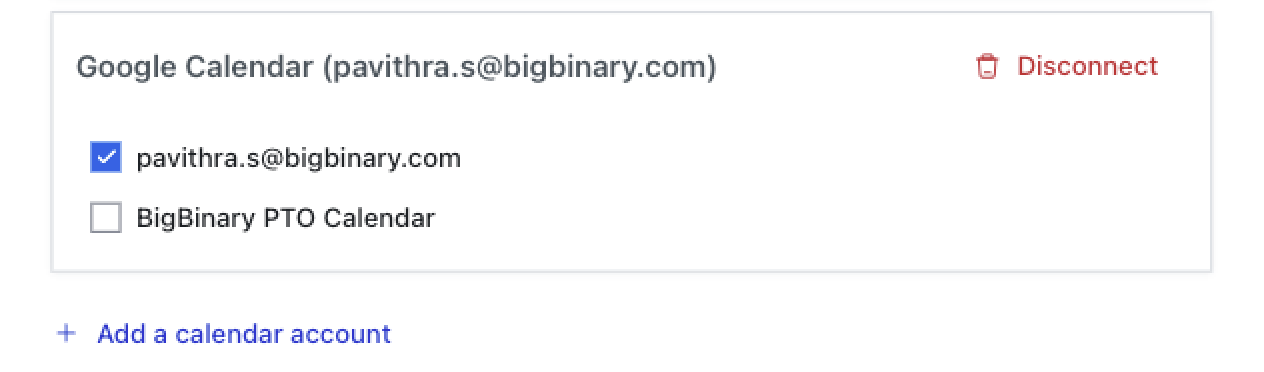
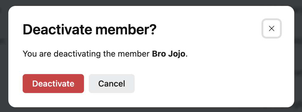
✅ Do's
Reference links
https://github.com/bigbinary/neeto-engineering-ui-ux/issues/32