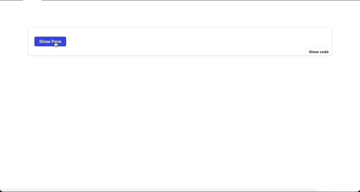
Side panels are the panels on the side of the screen. By default the side panels are hidden and get activated when user activates it through a button.
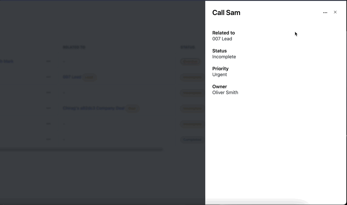
Anatomy
Title
Body
-
Actions
Title
The title is like the heading of the pane. It's usually at the top and tells you what the pane is about.
Follow the content guideline for heading and subheadings.
Body
The body is the main part of the pane. It's where you see the actual content or information related to the title. It can contain text, images, charts, form or any information relevant to the topic.
Actions
Actions are most often represented as buttons and allow users to confirm, dismiss, or acknowledge something. Follow the content guidelines for buttons
When to use
While adding/editing content information.
For complex forms and large content.
Best practices
Use Pane to display input fields or complex forms.
If Modal is being used to display complex forms or large amounts of information replace it with Pane. We can ignore this rule for Modals that are triggered by a Pane because displaying a Pane over a Pane is not user friendly. For example refer this documentation.
-
Use Modals for confirmations. Every confirmation with or without an input field should be a modal. https://www.figma.com/file/zhdsnPzXzr264x1WUeVdmA/02-Components?type=design&node-id=104-20&mode=design&t=wCxOWGY1xhY5Y8Gn-0
Examples
Refer this documentation.
Do's and Don'ts
🚫 Don'ts
✅ Do's
Reference links
https://github.com/bigbinary/neeto-engineering-ui-ux/issues/8