Neeto goes Green! We're thrilled to announce the release of NeetoUI v6.8.1-beta and NeetoMolecules v1.19.10-beta, featuring a refreshed brand identity designed to enhance the overall user experience. Get a sneak peek at what's new!
GitHub issue ref
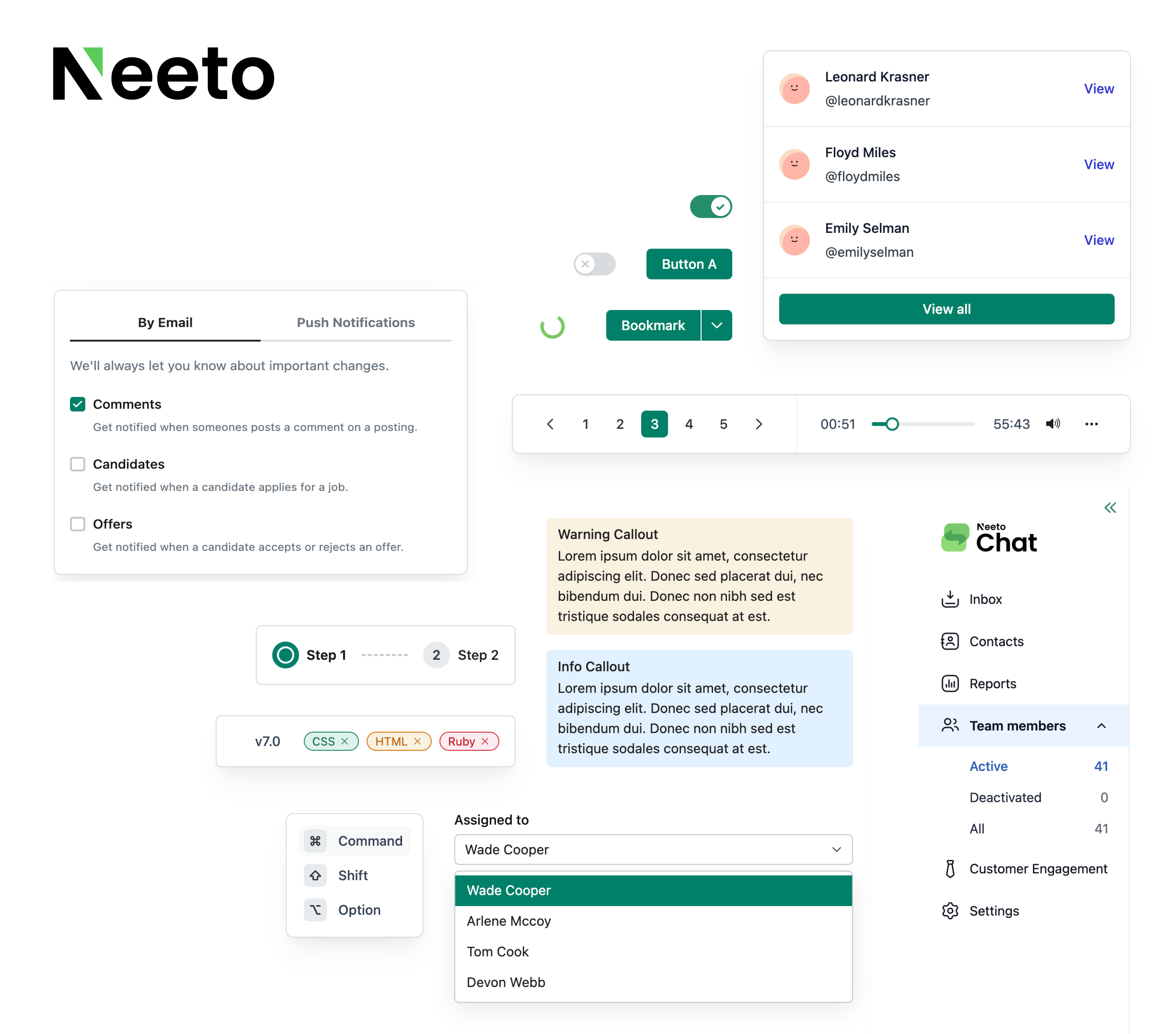
NeetoUI v6.8.1-beta
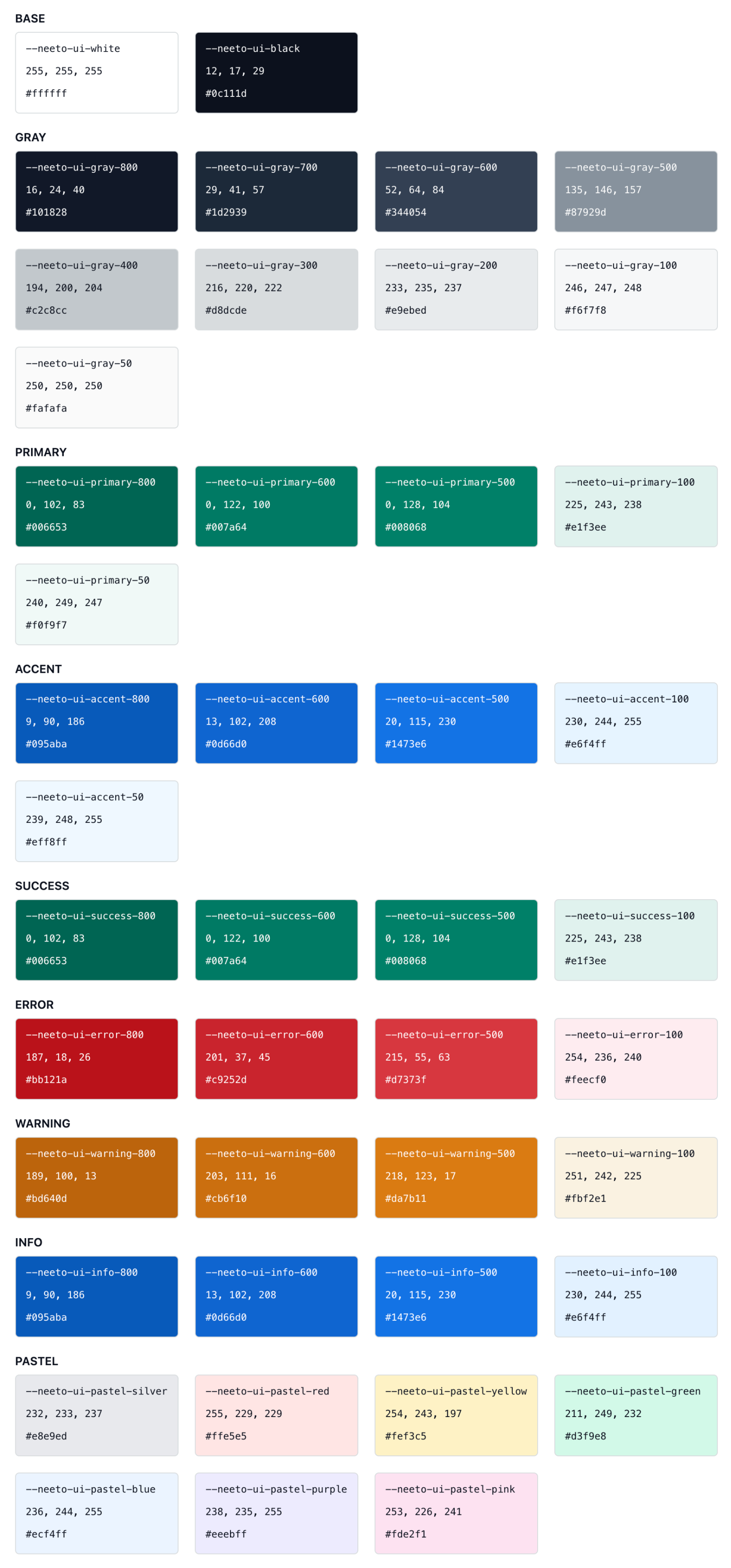
1. Revamped color palette 🎨
Brand in Green: We've updated our brand color from "Blue" to a more refreshing "Green".
Enhanced Readability: The contrast of gray color swatches has been improved, making text crisper and easier to read across all interfaces.
Subtle Blue in Dark Gray: A touch of blue has been added to the new dark gray, ensuring text readability even when using light gray backgrounds for text.
Accent Color Introduced: A brand new "Accent" color with various swatches has been introduced. This is ideal for highlighting interactive elements like selected sidebar menu items or table rows.
Dark Mode Refresh: The colors used in dark mode have also been updated to complement the new overall palette.
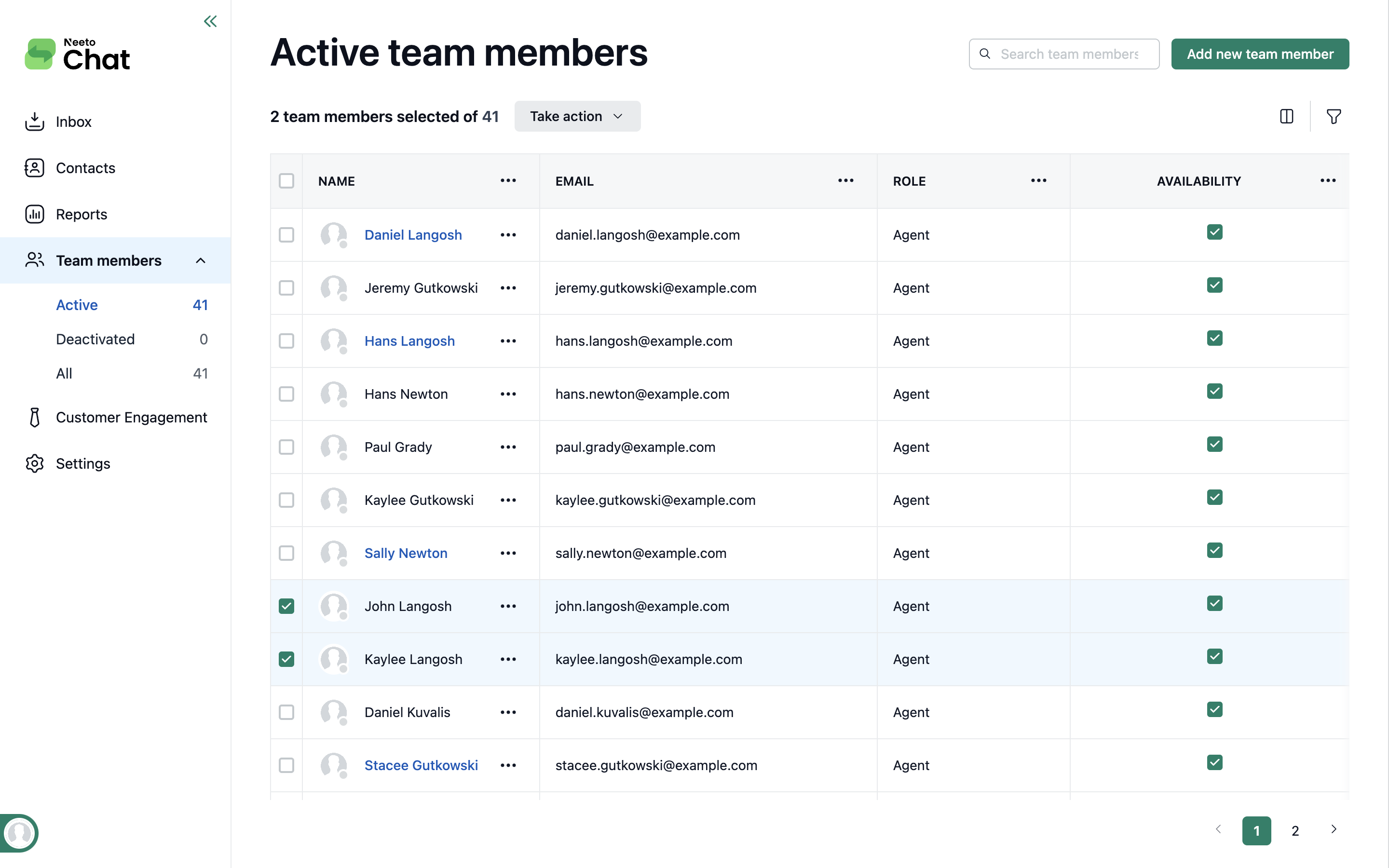
2. Enhanced Table UI for Improved Readability
Increased column title font size for better clarity.
Slightly increased row height for improved content visibility.
Subdued border color contrast and optimized text readability for a focused user experience.
Consistent table border color that aligns with the Sidebar border for a unified visual style.
Updated row selection styles to maintain clear data readability when a row is selected.
After
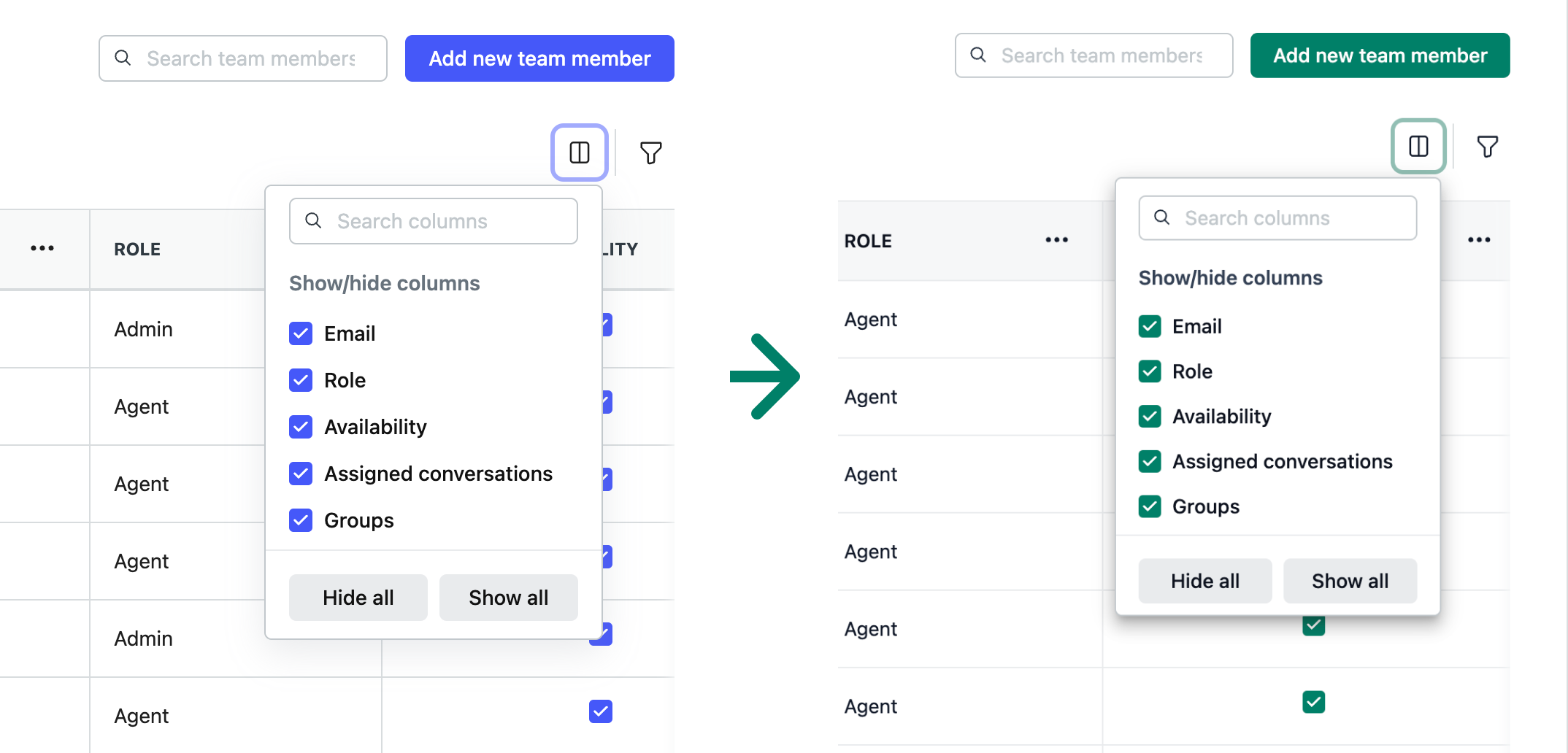
3. Improved Dropdown Visibility with Enhanced Box Shadows
Refined box shadows to create a more precise visual distinction between Dropdowns and underlying content, improving overall visibility.
.png)
Before and After
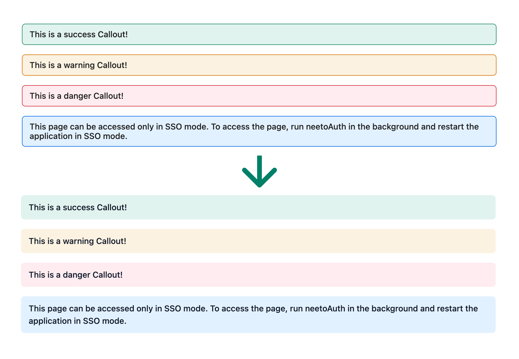
4. Improved Callout styles
Increased line height for improved content readability.
Removed borders for a sleeker callout appearance.
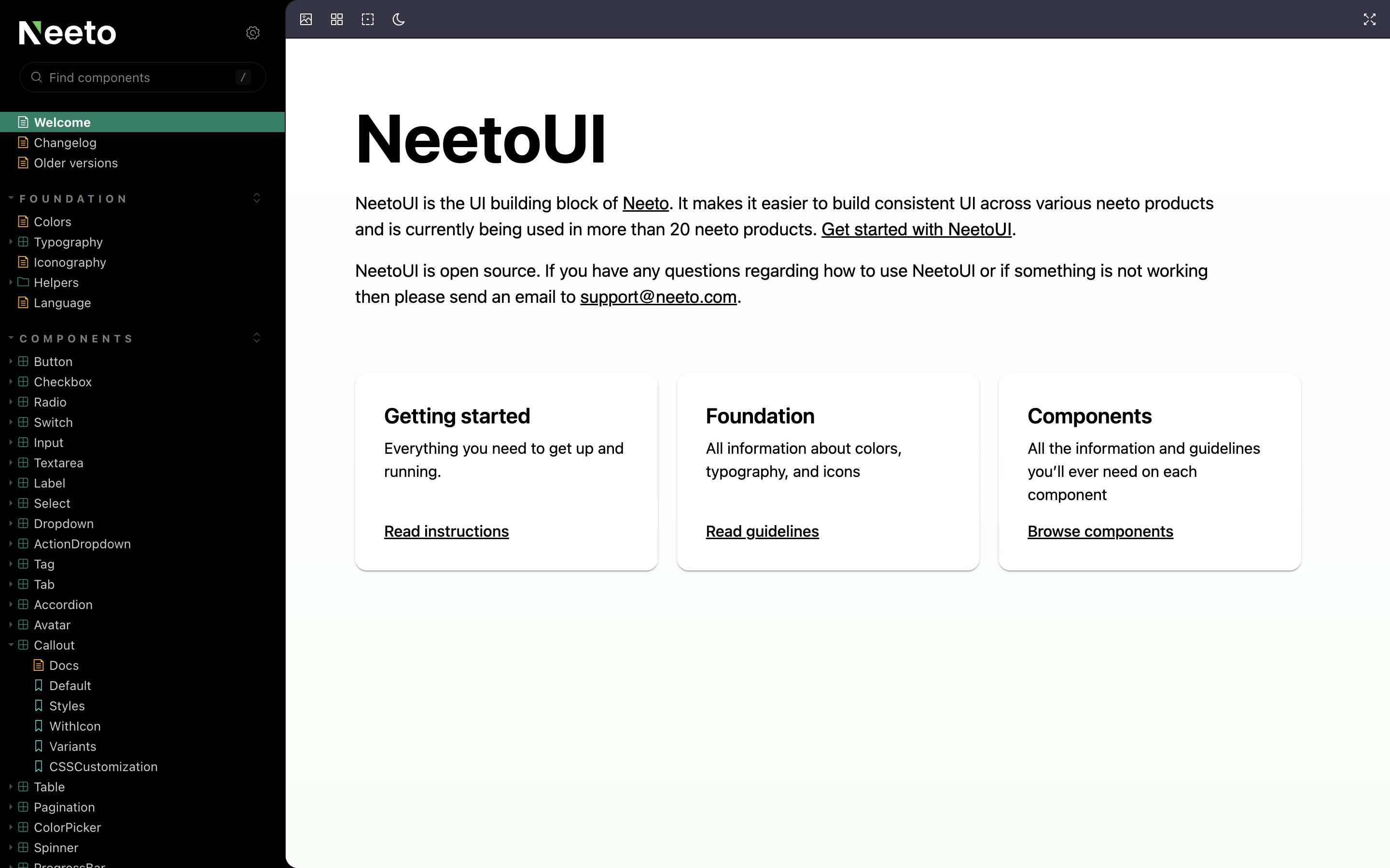
5. Storybook Enhancements
Aligned Storybook Theme with Branding: Updated the Storybook theme to align with the branding, ensuring a consistent visual experience.
-
Enhanced Documentation Readability: Enhanced the readability of Storybook documentation, making it easier for developers to grasp and leverage component functionalities.
NeetoMolecules v1.19.10-beta
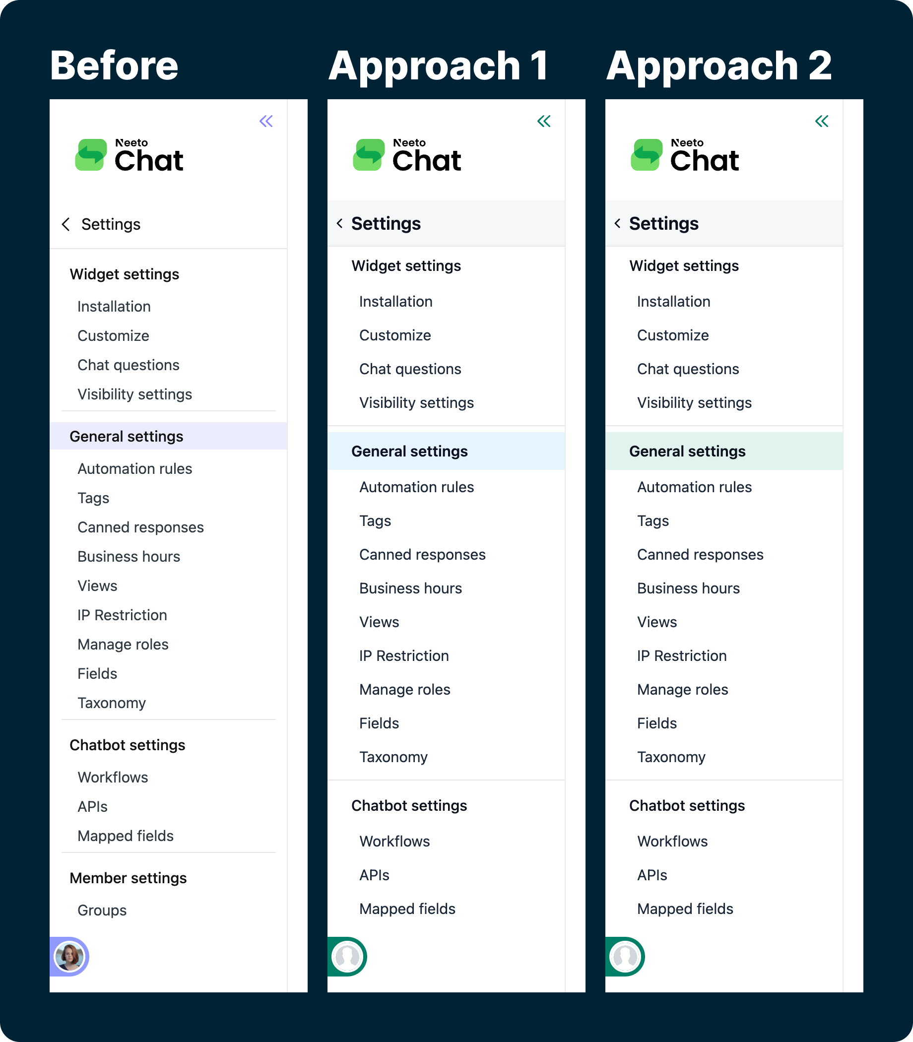
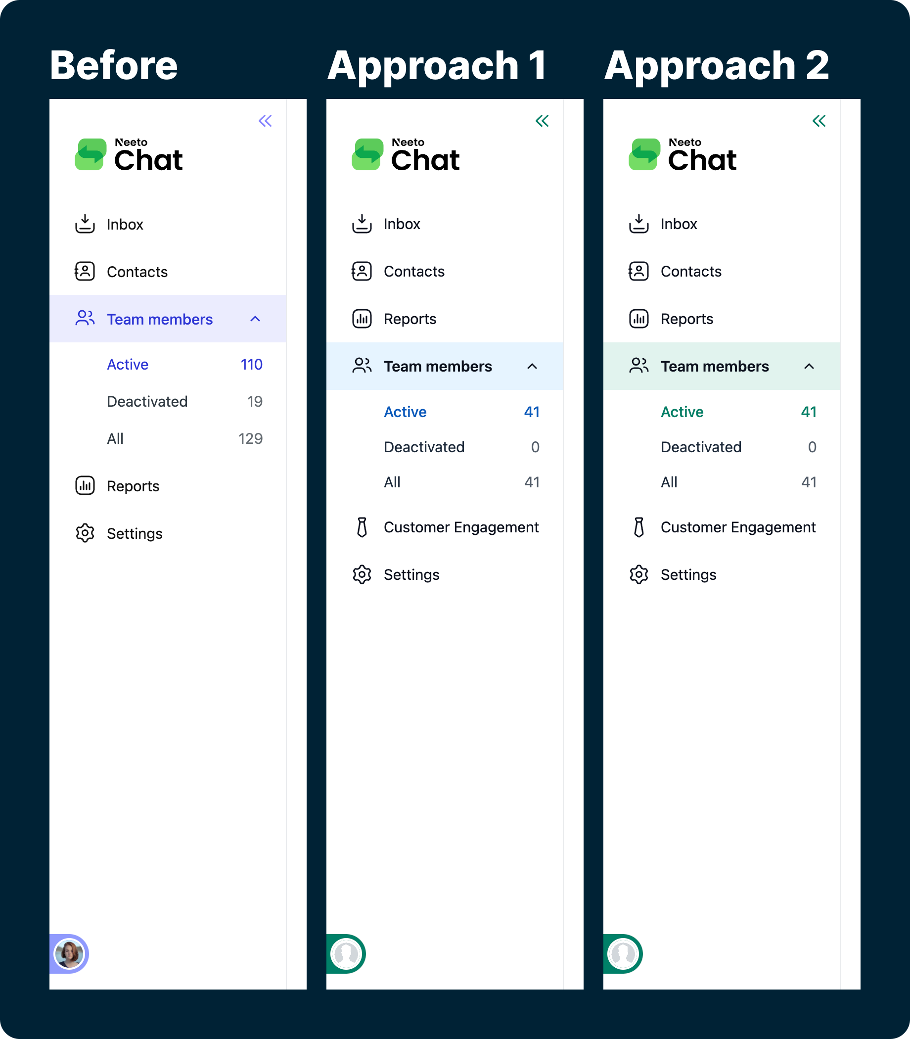
1. Sidebar enhancements
Enhanced font hierarchy and optimized spacing for a cleaner, more modern look.
Increased sub-menu item heights for better accessibility.
Refined menu selection styles for more precise interaction and consistent user experiences.
Beta release uses Color Approach 1, aligning with the new brand identity.
Kudos to the team 💃
A big shout-out to Avinash and Sudhish for their insightful contributions during the color palette discussions! We're excited to keep refining it together.